Logo Design
Digital wealth management
Surpriseyou
The Challange


The challenge was to design a logo that clearly represents a CRM rewarding system.The logo needed to feel professional, yet edgy and modern enough to stand out. It had to visually communicate value, recognition, and long-term customer relationships without appearing overly playful or generic. Balancing structure and creativity was key, ensuring the final identity reflects a reliable system.
Our Solution
The logo features a square gift box that represents the core of our CRM reward system—value, appreciation, and delight. The square symbolizes stability, fairness, and trust, while the gift element conveys recognition and motivation. Together, they illustrate how we turn customer relationships into lasting loyalty through meaningful rewards.


Logo Design
Hau.Chiim
Indonesian Streetfood Stall
The Challange
The client needs to rebrand his food stall to create a stronger and more recognizable identity. Specializing in wonton and chili oil noodles, the rebranding focuses on developing a logo that clearly represents the products, highlights their bold flavors, and helps the stall stand out while remaining memorable and appealing to customers.

Our Solution
The solution introduces a playful logo featuring a boy and a girl as the main characters. The boy wears a bonnet hat shaped like a wonton, while the girl has curly hair and a hat inspired by a noodle bowl, creating a fun and memorable visual that directly reflects the food offerings. This character-based approach makes the brand more approachable, distinctive, and easy for customers to recognize.

Logo Design
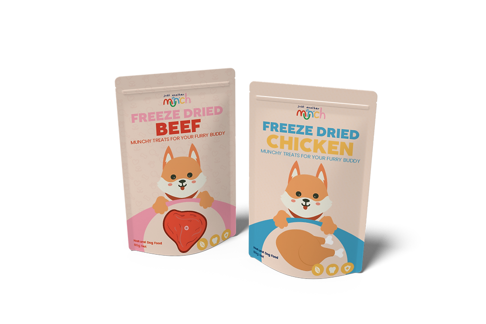
Just Another Munch For Pet
Freeze Dried Pet Food
The Challange
The client is launching a new pet food brand that serves multiple types of pets, including cats, dogs, rabbits, parrots, hamsters, and other small animals. The logo needs to be fun, friendly, and easily recognizable, while clearly representing a brand that offer pet food products. The identity must feel approachable for pet owners and flexible enough to be applied across different packaging types.

Our Solution
The logo design uses a colorful, playful typeface to reflect the fun and caring nature of the pet food brand. A key highlight of the logo is the customized “N” letter, which is creatively transformed into the shape of a standing dog, making the logo instantly recognizable and emotionally engaging. This unique typographic element adds character and reinforces the brand’s focus on pets in a subtle yet clever way. Bright, cheerful colors are applied to enhance visibility and shelf impact, while the overall logo remains simple and flexible for use across different packaging types and brand applications.


