

Branding Package
Putehku Beauty
Malaysian Skincare
-
Develop a whitening lotion tailored for the Malaysian market
-
Target teenagers and young women as the core audience
-
Represent a modern Malaysian girl identity
The Challenge
-
Teenagers and young women in Malaysia
-
Beauty-conscious and trend-aware consumers
-
Values inclusivity and diverse representation


Target Audience
-
Embraces a bright, girly, and youthful visual identity
-
Uses pink-centric tones with soft pastel accents
-
Applies a cheerful and approachable color palette
Visual Direction
Our Solution
-
Creates a cheerful and approachable visual identity
-
Uses a cute doodle-style illustration approach
-
Features three Malaysian girls as key visual elements
-
Represents Chinese, Indian, and Malay backgrounds
Youthful, Feminine, Diversity, Vibrant, Doodle, Cute
Keywords

Branding Package
Just Another Munch For Pets
Pet Food
-
Challenge to develop a cohesive pet food brand with two distinct packaging systems
-
Balance clear differentiation between product categories while maintaining a unified identity
-
Establish strong visual consistency across logo, typography, and layout
-
Create effective color-coding to guide quick product recognition
The Challenge

-
Young to middle-aged pet owners
-
Highly conscious of pets’ health and nutrition
-
Urban, lifestyle-driven individuals
-
Own a variety of pets (cats, dogs, rabbits, birds, small animals)
Target Audience


-
Creates a clear visual hierarchy for easy product recognition
-
Balances playfulness with clarity and functionality
-
Ensures strong shelf impact and visibility
-
Builds a cohesive yet flexible packaging system
Visual Direction
-
Uses cute pet illustrations to create an emotional connection with pet owners
-
Applies a colorful, eye-catching palette to attract attention on shelves
-
Features playful cat and dog illustrations for the dried meat and chicken range
-
Highlights rabbits, parrots, hamsters, and small pets for the veggie and seed range
Our Solution
Balanced, Colorful, Modern, Cute
Keywords
Branding Package
Just Another Munch (Rosti)
Street Food
-
Develop a logo that clearly represents rosti as a potato-based Swiss street food
-
Ensure alignment with the parent brand, Just Another Munch Company
-
Communicate a casual, street food vibe
The Challenge

-
Young adults and casual food lovers
-
Urban consumers who enjoy street food culture
-
People looking for quick, satisfying meals
Target Audience

Visual Direction
-
Uses a warm beige and bold red color palette
-
Creates a strong, appetizing contrast for visibility
-
Features cute stacked potato illustrations as the main visual
-
Emphasizes the rosti as a potato-based product
Our Solution
-
Develops a cohesive visual system across all brand touchpoints
-
Features a mascot with three stacked cute potato illustrations
-
Applies a playful and friendly illustration style
-
Humanizes the brand to feel more approachable
-
Reinforces the core ingredient through visual storytelling
Warm, Appetizing, Playful, Friendly
Keywords
Branding Package
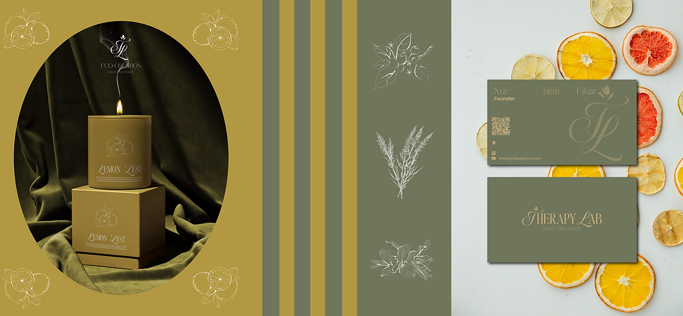
Therapy Lab
Eco-Friendly Scented Candle
-
Stand out in a saturated candle market filled with similar minimal aesthetic brands
-
Communicate eco-conscious values without relying on overused “green” visuals
-
Translate intangible qualities like scent, memory, and nostalgia into a visual identity
The Challenge
-
Young adults to early 40s
-
Environmentally aware individuals seeking sustainable lifestyle choices
-
Customers drawn to nostalgic, calming, and sensory-driven experiences
Target Audience


Visual Direction
-
Earthy & Organic Palette
-
Natural Textures
-
Inspiration from wood, linen, clay, and raw materials
-
Clean layouts with intentional spacing and refined composition
Our Solution
-
Developed a timeless logo that reflects softness, balance, and calm
-
Created a cohesive visual identity system adaptable across packaging, printing, and social media
-
Designed packaging that emphasizes sustainability and tactile experience
Nature, Earth, Elegant, Nostalgic
Keywords