
Packaging Design
Putehku Beauty
Malaysian Skincare
The Challenge
-
Develop a whitening lotion tailored for the Malaysian market
-
Ensure the brand feels culturally relatable and authentic
-
Reflect the image of a modern Malaysian girl

-
Seeks approachable and easy-to-use skincare solutions
-
Attracts teenagers to young adults
-
Targeting young women in Malaysia
Target Audience
Visual Direction
-
Focuses on a soft, cheerful, and inclusive visual identity
-
Feels youthful while staying culturally connected
-
Uses a bright, girly color palette as the core direction


Our Solution
-
Creates an approachable and friendly visual identity
-
Features a cute doodle-style icon as a key visual element
-
Illustrates three Malaysian girls representing Chinese, Indian, and Malay backgrounds
Youthful, Feminine, Diversity, Vibrant, Doodle, Cute
Keywords

Packaging Design
Tapaw
Packaging for snacks and beverages
-
Develop a food and beverage packaging brand named Tapaw
-
Inspired by “tapau,” a Malaysian slang for takeaway food
-
Build a strong and recognizable brand identity
-
Reflect convenience and on-the-go lifestyle
The Challenge

-
Targets young urban consumers and working professionals
-
Includes students, office workers, and busy individuals
-
Relies on takeaway food as part of daily routines
Target Audience
Visual Direction

-
Captures the energy of everyday takeaway culture
-
Maintains a bold and practical visual identity
-
Uses a vibrant, high-contrast color palette
-
Incorporates warm reds, yellows, and earthy tones
-
Use red and yellow to symbolize prosperity and positivity
-
Feature a cat mascot as the main visual element
-
Depict the cat holding a food package to reinforce takeaway concept
-
Incorporate a bold, chonky typeface for “Tapaw”
Our Solution
Chonky, bold, cute, memorable
Keywords


Packaging Design
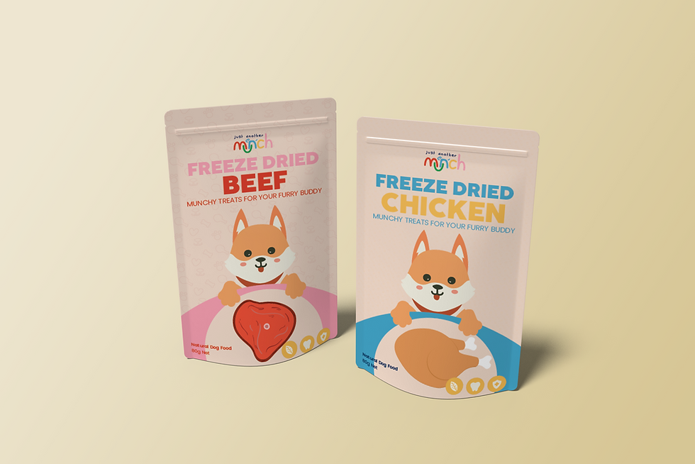
Just Another Munch For Pet
Freeze Dried Pet Food
The Challenge
-
Launch a pet food brand with a clear packaging strategy
-
Develop two distinct packaging types for different product categories
-
Maintain a cohesive and consistent brand identity across both designs
-
Make products easy to recognize on shelves

Target Audience
-
Targets young to middle-aged pet owners
-
Highly conscious of pets’ health and wellbeing
-
Typically urban and lifestyle-driven
-
Prioritizes quality ingredients, safety, and nutrition
Visual Direction
-
Balances health-focused credibility with warm, lovable charm
-
Creates packaging that feels both trustworthy and engaging
-
Uses soft, natural tones like muted greens, beige, and creamy white
Our Solution
-
Introduces two distinct packaging systems to clearly separate product categories
-
Applies color-coding to differentiate each category while keeping brand consistency
-
Uses a unified logo, typography, and layout structure across both designs
Balanced, Colorful, Modern, Cute
Keywords
